dinsdag 31 mei 2011

seems like yesterday

Nog een layout voor in het familie-album "Het Steenen Tijdperk", met foto's van mijn schoonvader in z'n jonge jaren. Aan de andere kant van deze layout komt er nog een met foto's van hem op latere leeftijd. Veel zijn er niet, want hij is veel te vroeg overleden (op z'n 46e, ik heb hem nooit gekend). Papier is van Bo Bunny, embellishments voornamelijk van Tim Holtz, wat kant, bedels, achtergrondstempels (geƫmbost met goud). De geflockte fotoframes komen van de Xenos. Deze layout doet mee bij CFY # 13.
Bedankt voor het kijken en tot gauw!

Another layout for our family-album "Het Steenen Tijdperk", these photos show my FIL when he was young. I will make another layout to complete a spread about him, with photos when he was older. Too bad there aren't many photos of him, because he passed away too early.
Designpapers are from Bo Bunny, embellishments by Tim Holtz mainly, and some lace, charms, background stamps (embossed in gold). The flocked photoframes were bought in a local store. I'm entering this one at  challenge # 13 at CFY.
Thanks for watching, see you soon!

paper piecing

Een oude techniek, paper piecing, was uitdaging nr. 5 bij the (Paper) Trail Makers Challenge Blog in de maand mei. Heel eerlijk gezegd, ben ik er niet kapot van, ik vind het veel te tijdrovend en met stanzen bereik je hetzelfde effect. Maar ja, als je alle uitdagingen gedaan hebt, moet deze dan ook maar. Ik heb gebruik gemaakt van een plaatje op internet (want ik had geen stempels met schapen), en dat overgenomen op cardstock, weer uitgeknipt en met foamtape verhoogd opgeplakt. De onderdelen heb ik wat kleur gegeven met distressinkt. Het gras is met de hand geknipt. Ik kan niet de hele layout laten zien, want die is voor iemand die mijn blog leest en dan is het verrassingselement eraf.
Bedankt voor het kijken en tot gauw!


At the (Paper) Makers Trail Challenge Blog, challenge # 5 involved the paper piecing technique. To be honest, I don't like this technique, because it takes up so much time and I can get the same effect with my dies. But, since I have taken all other challenges at their blog, I forced myself to take this one too. So here it is. I used an image from the net, because I didn't have any stamps with sheep (that I needed to complete this layout). Printed and resized it, then cut out all the pieces  and colored with distress ink. I put the sheep together with foamtape to get some dimension in the image. Also I did some fussy cutting on the grass border. I cannot show the complete layout yet, because I made it for one of my followers (and it has to be a surprise for her).
Thanks for watching, see you soon!


maandag 30 mei 2011

postcrossing kaartje

Sommigen van jullie weten dat ik ook aan postcrossing doe. Voor degenen, die niet weten wat dat is: dan stuur je en ontvang je kaartjes van mensen uit de hele wereld. Je moet je daarvoor wel aanmelden bij http://www.postcrossing.com/ om adressen op te vragen. Zodra er een kaartje van jou ergens ter wereld is aangekomen, krijg jij er ook weer een. In je profiel kun je aangeven wat voor soort kaarten je leuk vindt om te ontvangen, en vandaag mocht ik er een sturen naar Schotland, naar iemand die graag zelfgemaakte kaartjes wil hebben. Dus heb ik deze gemaakt (met papier van Prima Marketing, stempel is van Hero Arts).
Mijn ontvangen kaartjes kun je hier zien: http://worldgreetings-sylvia.blogspot.com/
Bedankt voor het kijken en tot gauw!

Some of you might know that I am a postcrosser. In case your didn't: at http://www.postcrossing.com/ you can register and receive addresses of people from all over the world to send a postcard to. As soon as one of your cards has arrived, you'll be next in line to receive one. It's really fun to do, because you'll never know when there will be "snail mail" on your doormat. Anyway, sometimes someone likes to receive homemade cards and today I got an address in Scotland, this woman welcomed any homemade card. I made her this one, with designpapers from Prima Marketing and the sentiment from Hero Arts. The cards I receive are being showcased here: http://worldgreetings-sylvia.blogspot.com/
Thanks for watching, see you soon! 

lay out

Deze layout heb ik heel snel gemaakt (het is niet echt een mooie, maar ja, het moet maar zo), om nog snel mee te kunnen doen met 2 uitdagingen: de count up challenge van Scrapdelight nr. 4 (4 foto's, 4 lintjes, minimaal 4 eyelets en een titel van een liedje met exact 4 woorden). Verder doet hij ook mee met challenge nr. 6 (gebruik verf) bij the (Paper) Trail Makers Challenge Blog. De foto's zijn van het Empire State Building in New York (maar dan van februari 2008), vandaar ook de titel Empire State of Mind (Alicia Keys). De sterren zijn masks van Heidi Swapp, normaal gebruik ik masks met inkt, maar voor de uitdaging nu met verf.
Bedankt voor het kijken en tot gauw!

This layout was quickly made to meet the deadline of 2 challenges: at first the Count up Challenge # 4 at Scrapdelight (use 4 photo's, 4 pieces of ribbon, minimal 4 eyelets and the title of a song with exactly 4 words) and challenge # 6 at the (Paper) Trail Makers Challenge Blog (use paint). The photos were taken in New York (February 2008) of the Empire State Building, hence the title Empire State of Mind (Alicia Keys). The two stars are masks by Heii Swapp which I used with paint, instead of the usual ink. It is certainly not a beautiful layout, but it will have to do (otherwise I couldn't make the deadline).
Thanks for watching, see you soon!

zondag 29 mei 2011

aankopen NY

Dat je goed kunt shoppen in New York is bij iedereen wel bekend, neem ik aan. Uiteraard moest ik naar Michaels, die inmiddels ook een vestiging heeft in Manhattan. Gelukkig had ik net voor we vertrokken nog wat leuke kortingscoupons kunnen printen thuis, die me heel goed van pas zijn gekomen. Rob moest verplicht mee, want je mag maar 1 coupon per persoon per dag inleveren. Dat werd dus apart afrekenen. Aangezien Michaels niet echt midden in Manhattan zit, maar meer uptown, zijn we er "maar" 1 keer geweest, maar dan wel in 1 keer goed. Dit was de buit: (en met lekker veel korting en een lage dollarkoers was ik nog goedkoper uit dan ik ingeschat had!). De grote zak met lintjes lag op mij te wachten in een zgn thriftshop (kringloopwinkel), waar we toevallig langsliepen. Voor maar 4 dollar heb ik de vondst van de dag maar meegenomen, hij liep echt naar me te roepen: neem me mee, neem me mee!!
Bedankt voor het kijken en tot gauw!


Shopping in New York is fun! Michael's Arts and Craft is also located in Manhattan and with my coupons I got a lot of stuff, that went home with me! The big bag of ribbons and lace was waiting for me at a thrift shop, that we happened to stumble upon. Lots and lots of great ribbon for only $ 4 (isn't that a bargain??).
Thanks for watching, see you soon!

weer thuis

Ik ben weer thuis, met een jetleg (en dus hoofdpijn). Gisteren waren we al om 5.00 uur op Schiphol, een uurtje eerder dan gepland. We zijn met de trein naar huis gekomen, omdat de bussen zo vroeg nog niet rijden op zaterdag. Thuisgekomen eerst maar even wat bijgeslapen, want er stond dit weekend nog veel op het programma. Ik moest Joyce d'r afstudeerscriptie nog nakijken en 's avonds hadden we kaartjes voor Mary Poppins. Vandaag nog een cropdag bij Scrapdelight, dus het was een druk weekend. Onze week in NY was erg leuk, de temperatuur aldaar was lekker, maar het was wel druk in de city vanwege Memorial Day weekend. We hebben ongeveer alles gedaan wat op onze planning stond en heel veel gezien en gewandeld, o.a. op Brooklyn Bridge en natuurlijk lekker gewinkeld bij Michael's.  Bijgaand een kleine impressie:


We're back (with a jetleg). Yesterday we arrived at Schiphol Amsterdam at 05.00 AM, an hour earlier than expected and took the train home. Buses are not available that early on a Saturday :(  Took just a few hours to get some sleep, otherwise I couln't make it through the weekend. We had a wonderful time in New York City, the weather was fine and we did a lot of sightseeing and strolling along the various districts, a.o. a walk on Broolyn Bridge. And I did some scrapbook-shopping at Michael's!
Thanks for watching, see you soon!


vrijdag 20 mei 2011

Ben er even niet

Morgenochtend is het zover, dan gaan Rob en ik voor 8 dagen naar New York! Ik heb er echt zin in, even er tussenuit en lekker de toerist uithangen in een geweldige stad. Ik ben 3 jaar geleden al in NY geweest voor 5 dagen (samen met Joyce), maar dat bleek veel te kort te zijn voor alle dingen die we wilden doen en zien. Nu gaan we dus 8 dagen, voor Rob is het de eerste keer. Ik heb een dagprogramma gemaakt, zodat onze week er ongeveer zo uitziet:
zaterdag 21 mei, aankomst hotel in Manhattan ca. 16.00 uur, omgeving verkennen, 's avonds naar Times Square (met alle neonverlichting)
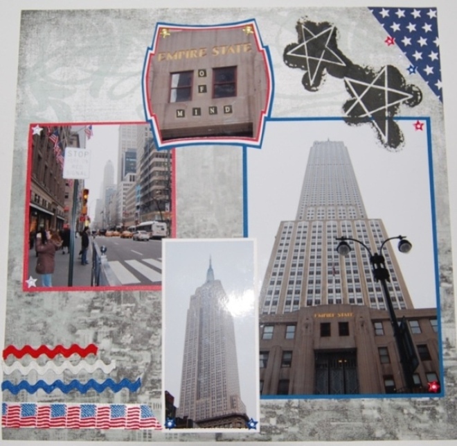
zondag 22 mei: hop on-hop off bus, Broadway, 7th Avenue, eventueel rondvaart, 's avonds: observation deck Empire State Building
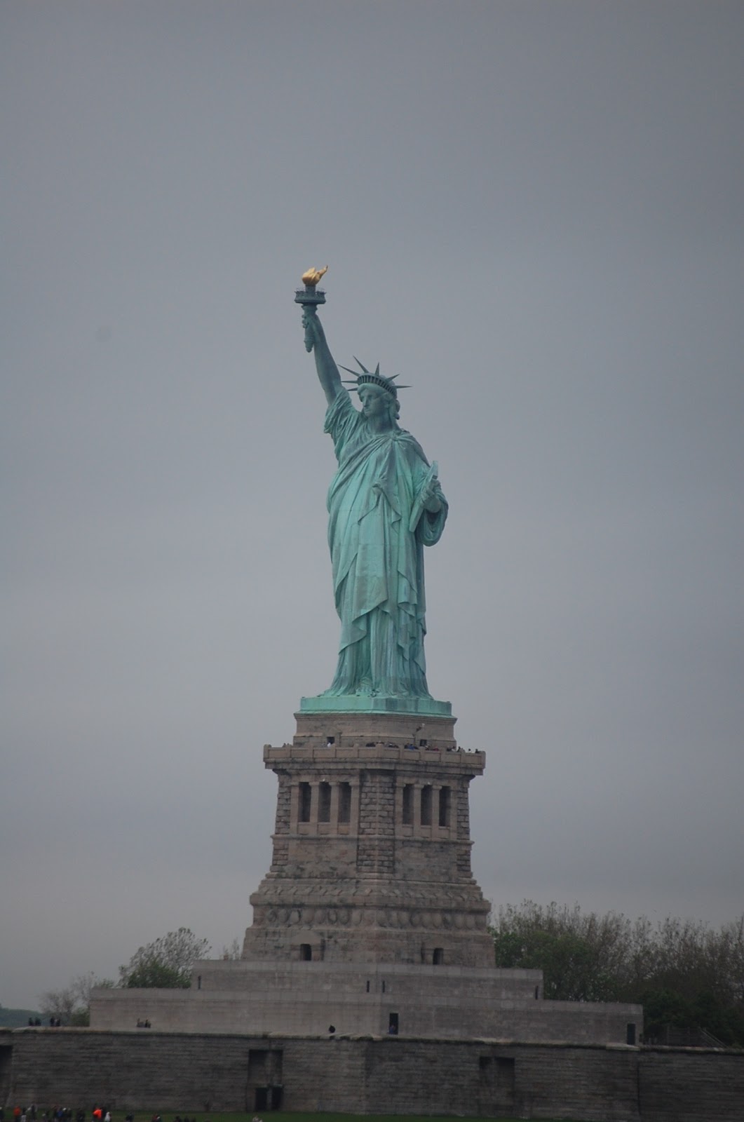
maandag 23 mei: Staten island Ferry, Statue of Liberty, Battery Park, Ground Zero, Little Italy, China Town, Soho, Wall Street, Chelsea market
dinsdag 24 mei: Central park (Strawberry Fields), 5th Ave, St. Patrick's Cathedral, Trump Tower, 's avonds: Top of the Rock (Rockefeller Plaza)
woensdag 25 mei: Madison Ave, Waldorf-Astoria hotel, Chrysler Building, Grand Central, wandeling Brooklyn Bridge, Public Library, 's avonds Broadway musical (Sister act??)
donderdag: 26 mei shoppen: Michael's, K-Mart, B+H photo, Beverly Trimming Shop, Garment District, Macy's
vrijdag:27 mei: uitchecken hotel, middag terugvlucht via JFK
zaterdag: 28 mei: weer thuis
Maar dit kan per uur verschillen, is totaal afhankelijk van het weer en hoeveel tijd we overal kwijt zijn.
Tot over ruim een week!

Tomorrow my DH and I leave for an 8-day trip to New York City. I am really looking forward to it and hope we'll have some time to relax, do some shopping and sightseeing over there. I have been in NY once (in 2008 with my daughter Joyce). Back then we stayed for 5 days, which was way too short for all the things we wanted to do. My DH has never been there, so it will all be new to him, it's so exciting to be there!!
Our global plans are:
Sat. May 21st Arrival at hotel in Manhattan ca. 16.00, explore surroundings, night: Times Square (neon lights!!)
Sun May 22nd: : hop on-hop off bus, Broadway, 7th Avenue, Circle Line River Cruise, night: observation deck Empire State Building
Mon May 23rd: Staten island Ferry, Statue of Liberty, Battery Park, Ground Zero, Little Italy, China Town,  Soho, Wall Street, Chelsea market
Tue May 24th: : Central park (Strawberry Fields), 5th Ave, St. Patrick's Cathedral, Trump Tower, night: Top of the Rock (Rockefeller Plaza)
Wed May 25th:  Madison Ave, Waldorf-Astoria hotel, Chrysler Building, walking on Brooklyn Bridge,   Grand Central, Public Library, night:  Broadway musical (Sister act??)
Thu May 26th: shopping: Michael's, K-Mart, B+H photo, Beverly Trimming Shop, Garment District, Macy's
Fri May 27th: check out, afternoon flight back home via JFK
Sat May 28th : back in the Netherlands

Plans may change without notice (depending on weather conditions)
See you back in 8 days!

spread

Voor het CJ Van Alles Wat van Ria (Noord-Brabant), heb ik de foto's van de Schotse Hooglanders gescrapt. Voor het linkerdeel van deze spread maakte ik gebruik van schets nr. 71 bij Sketchy Colors. Achter de cirkel links zit een tag, waarop Ria zelf nog wat journaling kan schrijven. Het papier is van verschillende merken. Dit is het geworden:
Bedankt voor het kijken en tot over 8 dagen!


The album of Ria (all kinds of everything) contains spreads of different places nearby her residence. I scrapped these photos for her: "Schotse Hooglanders" (a certain type of wild cows) and used sketch # 71 of Sketchy Colors for the left page. Designpapers are from different brands. Behind the circle on the left page there is a hidden tag, on which Ria can write some journaling when the album is back home again.
Thanks for watching, see you in 8 days!

donderdag 19 mei 2011

Pa

Deze layout van mijn vader komt in mijn jeugdalbum en heb ik gemaakt naar aanleiding van schets 254 bij Scrapbook Challenges. Ik vond de schets niet echt makkelijk, maar dat is dan ook wel weer de uitdaging. Alle randjes zijn gedistresst, het vogelkooitje is een stans en de kardinaal erin een stempel. Deze vogels had mijn vader vroeger in een voliĆØre achter in de tuin. De pagina komt uit een oude Libelle van 1944, de potkachel die je erop ziet, hadden wij thuis vroeger ook. Journaling staat op de verborgen tag achter de foto.
Bedankt voor het kijken en tot morgen!

Another layout for my personal album, made following sketch # 254 at Scrapbook Challenges. All edges were distressed, the birdcage is a die and the bird (a green cardinal) a wooden stamp. My dad used to keep this kind of exotic birds in a large cage in the backyard. The heater on the old magazine page looks exactly the same as the black one we had in those days. Journaling is on the hidden tag.
Thanks for watching, see you soon (probably tomorrow)!

dinsdag 17 mei 2011

Japanse tuin

Een dubbele layout, die ik een paar weken geleden al maakte, heb ik jullie nog niet laten zien. Ik heb hem gemaakt naar aanleiding van een uitdaging bij Scrapbook Challenges, volgens een schets. Heel eerlijk gezegd vind ik hem een beetje vol, maar ik ben wel tevreden met het resultaat. De kleuren die ik gebruikt heb voor de embellishments spatten ervan af, maar het zijn dezelfde kleuren die in de foto's voorkomen. De foto's zijn gemaakt in de Japanse tuin in Den Haag, waar ik vorig jaar met Annemarie ben geweest. De titel heb ik gemaakt met tandenstokers.
Bedankt voor het kijken en tot gauw!


This spread I made a few weeks ago, but it never made it to my blog, up until now. I made this one for a sketch challenge at Scrapbook Challenges. The vibrant colors I used for the embellishments come from the photos, they were taken at the Japanese Garden in The Hague, where Annemarie and I tested our use of the cameras last year. The title was made out of toothpicks.
Thanks for watching, see you soon!

zondag 15 mei 2011

opa

Nog een layout gemaakt voor Joyce d'r album, dit keer met papier van Graphic 45 uit 3 verschillende lijnen (Botanicallica, Fashonista, Communique). Met m'n kleine hartjespons heb ik heel veel hartjes uitgeponst en die gebruikt langs de boven- en zijkant van de foto. Met 6 van die hartjes in een rondje maak je dan ook weer bloemetjes. Verder nog wat distressrandjes (zonder inkt), een kantje, wat brads en een gesloopte oorbel, waar het woordje "love" vandaan komt.
Bedankt voor het kijken en tot gauw!

Another layout for Joyce's album. Designpapers come from Graphic 45 from 3 different collections (Botanicallica, Fashonista, Communique). I punched out lots of tiny hearts with a tiny shape punch and placed them as a border around the picture. Also I used the hearts as petals for home made flowers. A bit of lace, some brads and an old earring ("love") complete this layout.
Thanks for watching, see you soon!

Little big sister

Een heel vrolijke layout voor in het album van Joyce, volop kleur en geen enkel dessinpapiertje gebruikt! Ik barst van het papier, maar had eigenlijk geen enkel geschikt velletje, wat bij de foto's paste. Daarom heb ik het maar op deze manier opgelost: veel gekleurde lintjes als mat onder de foto en lekker veel bloemenbrads (kom ik daar ook eindelijk vanaf). Als schets heb ik de Paternoster schets bij Piens gebruikt, die Margot heeft geplaatst. Deze heb ik een slag gedraaid en in plaats van 2 kleinere foto's 1 liggende gebruikt. Hieronder zie je de inspiratie lo en daaronder mijn versie.
Bedankt voor het kijken en tot gauw!


A very bright colored layout for Joyce's album with lots of sparkling color, although I did not use any designpaper. Frankly spoken, I got tons of designpapers, but nothing seemed to match the colors in the photos. So I decided to use various types of ribbon as a mat for the picture, and used a lot of flower shaped brads. I used the continuing sketch at Piens, that Margot gave us as inspiration and turned it 45 degrees. I recplaced the two smaller pictures by one landscaped one.
Thanks for watching, see you soon!


vrijdag 13 mei 2011

kaart

Ik heb een kaart gemaakt, die al een tijdje op mijn to-do lijstje stond. Bijkomend voordeel deze week is, dat het de nieuwe uitdaging is bij OVA (napkin folded card). Tegelijkertijd doet hij ook mee aan de uitdagingen bij Double Dutch Challenge # 68 (maak een vintage card) en bij uitdaging nr. 4 van The (Paper) Trail Makers (gebruik minimaal 1 doily), 3 vliegen in Ć©Ć©n klap, zogezegd.
De tutorial voor de kaart vind je hier. Ik heb dubbelzijdig papier van Prima Marketing gebruikt. Voor de binnenkant heb ik een nestability uitgestanst (2x hetzelfde formaat) en die verspringend weer op elkaar geplakt, zodat je een soort van doily randje krijgt. Het midden hiervan is ook weer met een nestie uitgestanst en dat deel heb ik weer gebruikt op de band van de sluiting. Hierop een stempeltje van Prima wat bewerkt is met Crackle Accents (Ranger). Alle randjes zijn geĆÆnkt met Vintage Photo en Victorian Velvet (Ranger). De stempel aan de binnenkant is van Hero Arts. Randpons van Martha Stewart, pareltjes met de perlen pen en de bloem is ook van Prima, kant uit eigen voorraad.
Bedankt voor het kijken en tot gauw!


I wanted to make this type of card for a while now and at OVA's this is the new challenge for May (napkin folded card). You can find the tutorial here.
I used Prima Marketing designpapers and inked all edges and foldlines with distress ink (Vintage Photo and Victorian Velvet). For the inside I cut 2 pink circles with my Nestabilities (twice the same size) that I lined up unevenly to create a doily-like outline. The centre of these circles was also cut with a Nestability, this scalloped circle was set aside to form the decoration on the closure band. The sentiment is a clear stamp from Hero Arts. The image on the outside decoration is a clear stamp from Prima Marketing on which I poured Crackle Accents (Ranger) to get the worn look. Further I used some lace, Martha Stewart border around-the-page punch, a doily, pearl pen and some flowers (Prima and Wild Orchids).
I will enter 3 challenges with this card:
- OVA (napkin folded card)
- DDC # 68 (vintage card)
- The (Paper) Trail Makers Challenge blog (doily)

Thanks for watching, see you soon!

dinsdag 10 mei 2011

authentic beauty

Een vrolijke lente layout in pasteltinten voor uitdaging nr. 70 bij Sketchy Colors: gebruik roze, blauw en groen. Joyce op de (school-) foto is hier 8 jaar oud. Het papier is van Prima Marketing. Ik heb een venster gescheurd en de gematte foto erachter geplakt met rondom een gestikt randje (met de Sew Easy). Verder lekker veel bloemen, vlinders en wat kant. De titel is een diecut van My Minds Eye, met daaraan een hartjes bedel (gesloopt van een broche).
Bedankt voor het kijken en tot gauw!

A colorful layout in soft tones for challenge # 70 at Sketchy Colors: pink, blue and green. My daughter in the photo is 8 years young, the photo was taken at school. Designpapers are from Prima Marketing. I tore out a frame and glued the picture behind, then did some stitching all around the frame. With lots of layered flowers and butterflies it almost seems like spring (in fact this photo was taken in November 1995). The heart charm came from a broken pin.
Thanks for watching, see you soon!

maandag 9 mei 2011

Wim

Opnieuw een vintage layout voor mijn Vintage CJ met Maja Design papier (ik ben er bijna doorheen).
Deze foto's zijn van mijn schoonvader Wim in zijn jonge jaren. De bloemen rechtsboven en linksonder zijn zelfgemaakt van koffiefilters en gekleurd met distressinkt (dusty concord). De tutorial vind je hier.
De bloemen doen mee met uitdaging nr. 3 bij The (Paper) Trail Makers: maak je eigen bloemen.
Bedankt voor het kijken en tot gauw!


Another vintage layout for my Vintage Family album. Again I used Maja Designpapers. These heritage photos show my FIL when he was a little boy. The two tone flowers in the corners were homemade out of coffee filters: I used a Nestability die and dyed them with distress ink Dusty Concord. The tutorial for these flowers can be found here. I am putting these up for challenge # 3 at the (Paper) Trail Makers: create your own flowers.
Thanks for watching, see you soon!

zaterdag 7 mei 2011

play with us

Weer maar eens een vintage layout voor in mijn jeugdalbum. Deze foto's van mijn broertje en mij zijn uit 1963. (echt erg!) Het dessinpapier is opnieuw van Maja Design, de flourishes (of swirls) zijn gezet met de perlenpen, bloemen en kant komen uit m'n voorraad. Deze layout wordt ingezonden bij challenge nr. 2 van The (Paper) Trail Makers: maak je eigen flourish. Linksboven heb ik lila gebruikt, links onder zwart en rechtsonder heb ik lila en zwart gecombineerd.
Bedankt voor het kijken en alvast een gezellige moederdag allemaal!

Another vintage layout, these pictures of my brother and me were taken in 1963. Designpapers are Maja Design (again!), flowers and lace from my stash. I will take challenge # 2 at The (Paper) Trail Makers Challenge Blog: make your own flourish. Mine are made with pearl pens, one in lilac, one in black and the third one (right bottom) in lilac/black combination.
Thanks for watching, and a happy Mother's Day to you all!


vrijdag 6 mei 2011

the (paper) Trail Makers Challenge blog

Sinds kort ben ik volger van de (Paper) Trail Makers Challenge Blog, een leuke blog met elke 2 weken leuke uitdagingen. Aangezien de maand mei is uitgeroepen tot scrapbookmaand, hebben ze deze maand heel veel uitdagingen. Kijk maar eens op hun blog, en word ook volger, ze hebben er echt hele leuke uitdagingen.
Dit is wat ze er zelf over schrijven:


May is National Scrapbooking Month, so we decided to change it up a bit this month here at Trail Makers. It's also one of the busiest months of the year for us with baseball, soccer, school ending, so we created a way for you to be able to have the whole month to work on challenges and deal with your busy schedule. There will be 6 challenges posted throughout the month. Sometimes there will be 2 challenges per week and sometimes only 1. You'll be able to post your work all month to Mr. Linky's with the matching challenge. Every challenge will have a prize listed that you could win. We'll also have some Friday Fun for you(games!!!), Wednesday WOW's (where we showcase your work from the challenges) and Tuesday Tips and Techniques that we want to showcase for you using our projects throughout the month. And we'll also be showcasing our sponsors to let them know how much we appreciate their kindness!


For all those who love to plan....

Here's a few dates that you will want to mark on your calendar to start planning out your month!

On May 1st make sure you stop by to see The Paper Trail Debut projects from the DT with the May Kit.

May 2nd...Challenge #1 posted

May 4th...Challenge #2 posted

May 6th...Friday Fun posted

May 8th...Challenge #3 posted

May 11th...Wednesday WOW's posted

May 12th...Challenge #4 posted

May 13th...Friday Fun posted

May 18th...Wednesday WOW's posted

May 20th...Friday Fun posted

May 22nd...Challenge #5 posted

May 25th...Wednesday WOW's posted

May 26th...Challenge #6 posted

May 27th...Friday Fun posted

May 31st...all challenges due by 11PM EST

June 2nd...winners announced

Now just stop back and see what the challenges are going to be and what great prize you'll be able to have a chance at! We can't wait to see what you create for the challenges. It's going to be a fantabulous month where you can show your love of scrapbooking at Trail Makers and we'll share ours with

woensdag 4 mei 2011

Beautiful Amsterdam

Dit keer een hele strakke layout, in de categorie clean & simple. Dat zijn jullie niet van mij gewend, maar af en toe is het ook wel leuk om te doen (hoef ik niet zo over na te denken en dan kom ik ook nog eens door mijn oude papiervoorraad heen). De porceleinen kralen komen van Xenos. Deze doet mee bij de uitdaging bij The (Paper) Trail Makers, een kleuren-uitdaging. Hierbij de uitdaging en daaronder mijn uitwerking:


This clean & simple layout was made for the color challenge at The (Paper) Trail Makers. It's not really my style, but every once in a while it is fun to do. Designpapers are from my stash. Embellishments are porcelain beads with typical Dutch images and/or shapes.
Thanks for watching, see you soon!

dinsdag 3 mei 2011

Vintage cj

Nu mijn Vintage CJ weer thuis is, is er werk aan de winkel. Het album is prachtig geworden, maar ik had zoveel foto's meegestuurd dat lang niet alles gescrapt is. Dus ben ik nu de achterstand een beetje aan het inhalen. Het zelfgemaakte album met bijbehorende opbergbox blijkt veel te klein te zijn, dus zitten de lo's nu allemaal in een leren album, wat heel wat steviger is. De eerste spread die ik jullie wil laten zien, is die van Oma Bets (Elisabeth van Ark, een van de oma's  van mijn man). Als uitgangspunt heb ik hiervoor schets 251 bij Scrapbook Challenges gebruikt. Ik ben er zelf niet helemaal tervreden over, maar dat ligt waarschijnlijk aan de kleuren van de (vervaagde) kleurenfoto's. Papier is van Prima Marketing (Botanical). Rechts zit een pocket met daarin de overlijdensaankondiging.

Dan twee enkele layouts, die naast elkaar in het album komen. De eerste is Theoroda Apollonia Fransisca van der Heem (de echte moeder van mijn schoonmoeder, die overleed toen mijn schoonmoeder 5 jaar was). Achter de buitenste cirkel is ook weer een pocket gemaakt, waarin het originele trouwboekje wordt bewaard.
 Deze heb ik gemaakt naar aanleiding van de schets van april op Piens Atelier:

Ernaast komt de layout van Poe (de stiefmoeder van mijn schoonmoeder). Zij was huishoudster bij mijn schoonmoeder's vader Emil en hij is later met haar getrouwd. (Snappen jullie het nog?).
Deze layout zend ik ik bij de mei-uitdaging van OVA, gebruik de schets en 3 verschillende soorten kant.
Gebruikt papier van de laatste twee is van Maja Design. Rondom de cirkel en langs de bovenkant van de foto zit kant, uiteraard ook een prachtige stukje kant als embellishment aan de rechterkant en onder de foto heb ik kantband gebruikt als masker.
Bedankt voor het kijken en tot gauw!


My Vintage circle journal needs some extra work, because I sent too many pictures along with it. A lot of them haven't been scrapped yet, so I'm trying my best to complete it. The first spread I made following sketch # 251 at Scrapbook Challenges. I'm not quite sure about the colors, but the fainted color pictures needed to be in there as well as the b/w's, so it will have to do. The other two are single lay outs, the first one about the birthmother of my husband's mum (she died when my MIL was only 5 years old) and the other one about her stephmother.

I will enter the last one (Poe is her nickname) at the May challenge at OVA, using the sketch and 3 different laces. Papers I used are from Maja Design. You can see the lace as trim around the circle, at the top of the picture (to cover up some holes) and a beautiful old piece as embellishment. Also I used a lace tape as a mask under the picture.
Thanks for watching, see you soon!

zondag 1 mei 2011

Lievelingsjurk

Bij Piens Atelier plaatst Elvy elke maand een blinde scrap. De bedoeling is dat je aan de hand van de beschrijving een layout maakt. Dit was de beschrijving:

Ik zie een vel van 12 x 12 inch, het is dessinpapier met een heel klein beschaafd werkje erin.

Keurig in het midden gecentreerd zie ik een bracketvorm (twee van die accolades tegen elkaar aan) en daar overheen:
- Twee, niet al te grote staande foto's die onder elkaar zijn geplaatst.
- Ze zijn van elkaar gescheiden door middel van een lintje.
- De foto's zijn dubbel gemat waarbij de onderste mat links veel breder is dan rechts.
- De linker kant van de onderste mat is dan ook bewerkt met een randpons (je zou ook een gewone dubbele mat kunnen maken en dan links over de lengte van beide foto's een kantje kunnen plaatsen)
- aan de rechterkant, halverwege beide foto's een cirkelvorm met daarin de titel
- links van de bovenste en rechts van de onderste foto de nodige embellishments en journalings.
En dit heb ik ervan gemaakt:


Every month Elvy challenges us at Piens Atelier with a "blind scrap". For April the description is as follows:
- base is a 12x12" designpaper with just a little pattern
- in the centre I see 2 bracket shapes, on top of that there are
- 2 pictures, separated by a ribbon
- pictures are matted twice, the left side is wider than the right side
- lift side is punched with a border punch
- on the right side, halfway both pictures there is a circle with the title
- on the left top and right bottom of the pictues you'll find embellishments and journaling

This is what I came up with. Instead of 2 pictures I used 3 and I replaced the borderpunch by a sweet lace.
Thanks for watching, see you soon!